
Replies: 6 comments

|
Haha, pretty neat! But it breaks some part of this theme... I will dive into it tonight. |
|
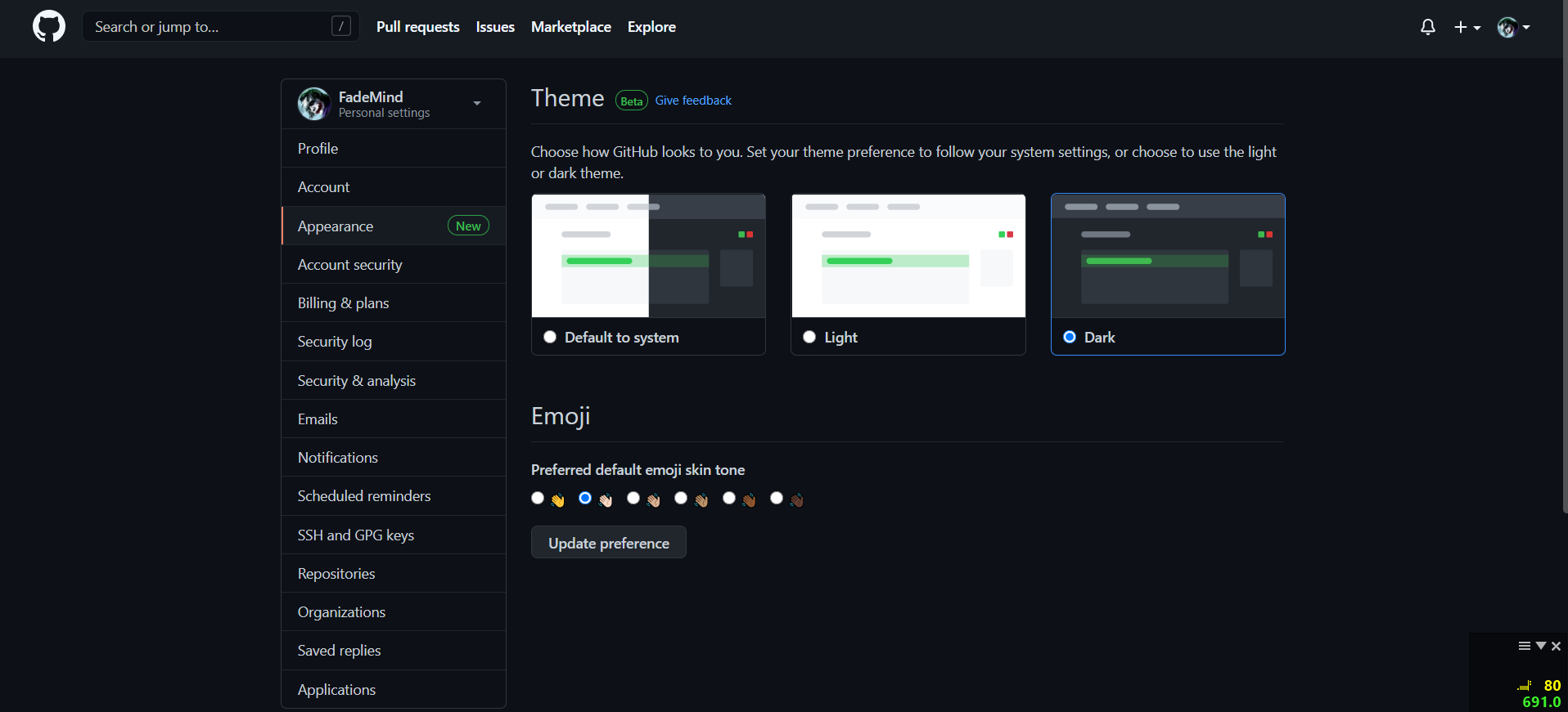
[NEED BETA TESTERS] I entirely rewrote the theme from scratch using almost exclusively CSS variables, since the new Official GitHub Dark Theme makes it possible. It lost some weight: From 91 748 characters to only 18 440! This should make material github lighter, faster, and easier to maintain. A lot of things changed: We're now closer to original GitHub design, in terms of borders, shadows, etc. (It's also more acceptable now than a few years ago due to GitHub improvements on their own design). Also I decided to apply the theme only when the dark mode (or auto) is chosen on github options. After all, it's a dark theme. It would as well allow us to release a material light theme one day... You can install this new theme for test purpose and let me know: https://github.com/CharlieEtienne/material-github/raw/material-github-2021-beta/material-github.user.css |

|
@CharlieEtienne see https://github.com/notifications |


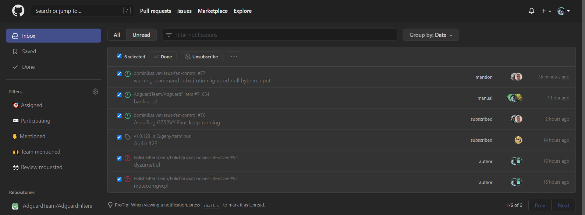
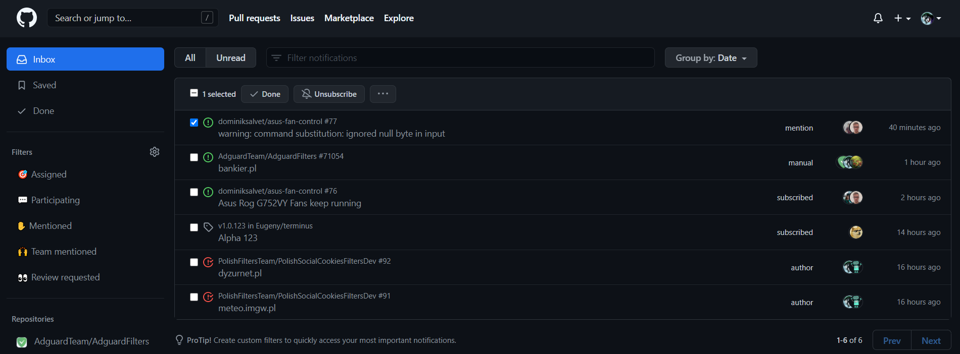
|
Should be better now. Thanks |
|
@CharlieEtienne https://github.com/notifications
shadow under menus from 3 dots menu after selecting some entries. |



|
@CharlieEtienne see |


Uh oh!
There was an error while loading. Please reload this page.
@CharlieEtienne

All reactions